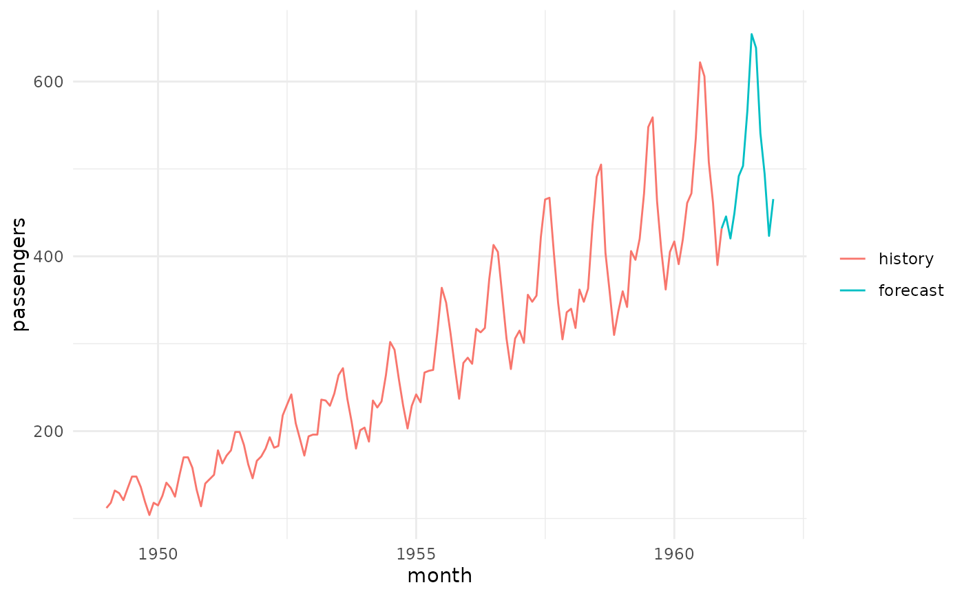
Generates a forecast plot for PredictionFcst. The point forecast is drawn over the time index. When a
task is supplied, the historical series is overlaid and the forecast region is drawn in a distinct colour,
connected to the last historical observation for visual continuity.
For quantile forecasts, symmetric quantile pairs (e.g. the 10% and 90% quantiles) are drawn as shaded central prediction interval ribbons over the forecast region, shaded darker for narrower intervals and labelled by their level (e.g. 80, 95) in a legend. Quantiles without a symmetric partner are not drawn.
Usage
# S3 method for class 'PredictionFcst'
autoplot(
  object,
  task = NULL,
  theme = ggplot2::theme_minimal(),
  facets = FALSE,
  ...
)
Arguments
- object
- task
(TaskFcst |
NULL)
Optional task providing the historical series to overlay. WhenNULL, only the forecast region is drawn.- theme
(
ggplot2::theme())
Theggplot2::theme_minimal()is applied by default to all plots.- facets
(
logical(1))
For keyed tasks, draw one panel per series instead of one coloured line per series. DefaultFALSE.- ...
(
any)
Additional argument, passed down to the underlyinggeomor plot functions.
Value
ggplot2::ggplot() object.